What did I learn over the 12-weeks Summer Internship?
Banyan Hills Technologies Embraces a New Era with Rebrand to "Canopy"
12 enriching weeks, 2 Canopy applications and 1 design system
During Summer 2020, I interned full-time as a UX Designer where I was responsible for coordinating and conducting customer research, developing designs, and prototypes of KPI and mobile applications. I had an incredible opportunity to work on multiple projects across public and private sectors with clients including M&M Systems and AT&T as well as co-lead a project which involved designing illustrations for the company.
I conducted user research to find user pain points. This project was in close collaboration with my product manager. After validating the product roadmap and prioritizing the top 5 pain points, I redesigned their existing dashboard and fixed the UX issues.
Clients

Role
UX Design Intern responsible for ideation, Interaction design, UI, handoff, product development
Methods
Design System, Product Thinking, Interactive prototype, Stakeholder Meeting, Experience Mapping, Interviews, Think Aloud Studies, Data Analysis, Affinity Diagramming, Opportunity assessment matrix for prioritization, personas, low and medium fidelity prototyping, design mockups & usability testing.
Duration
Summer 20', 12 weeks
Team
2 Senior UX Designers, 1 Head of Marketing, 1 Product Manager
Recommendation
Savani worked with me on a few design initiatives for our IoT product and did a fantastic job with everything I threw at her. She is a talented designer that has a passion for creating the best possible experience for the user. She is not shy about bringing new ideas to the table but also takes direction and feedback well.
She is very creative, has excellent people skills, and is an absolute pleasure to work with. I'm certain she has a bright career ahead of her!
- Stu Phelps, Sr. UX Designer at Canopy
Despite the first week, which was onboarding training, I was working on the projects for the following 12 weeks.
I conducted user studies during the second week and jumped into the first project in week 3. I had daily check-ins with my manager and three design critiques each week with designers from the cross-functional teams.
After tons of explorations and iterations, I presented my work on week 10, in front of my teammates, manager, and CEO. Looking back to the timeline, I find that 12 weeks ran so fast but I learned so many skills that I have grown into a way better designer after the internship.
Project Brief
Improving Efficiency of Canopy Cloud Foundation platform
My process started with understanding the user base who will be benefited from applications to assist the device details. My steps involved collaborating with the Marketing Head and Sr. UX Designer to gain more information about the problem at hand. The low fidelity and high fidelity wireframes were built around the priority issues.
In recent years, Banyan has developed one of its most important products: Canopy Cloud Foundation Platform (CCF). It is a unified software platform that integrates all previous Canopy product parts into one piece and makes them work together.
Challenge
Banyan Hills’s Employees Found It Low-efficient to Seek Product details for Canopy Cloud Foundation platform with the Initial Application
The Canopy Cloud Foundation platform requires product details in its development cycle. In the beginning, a simple application allowed Banyan employees to perform these tasks.
The most of the users found the existing application extremely time-consuming and overly complicated.
Solution
2 Desktop Applications & a Design System
Given the aforementioned challenge, I worked with 1 product manager and 8 engineers during the internship and designed two desktop applications and a design system, which successfully improves the efficiency of product testing.
#1 - Helps users efficiently sought product details through location
#2- Helps users efficiently Check Product Analytics - After Connection
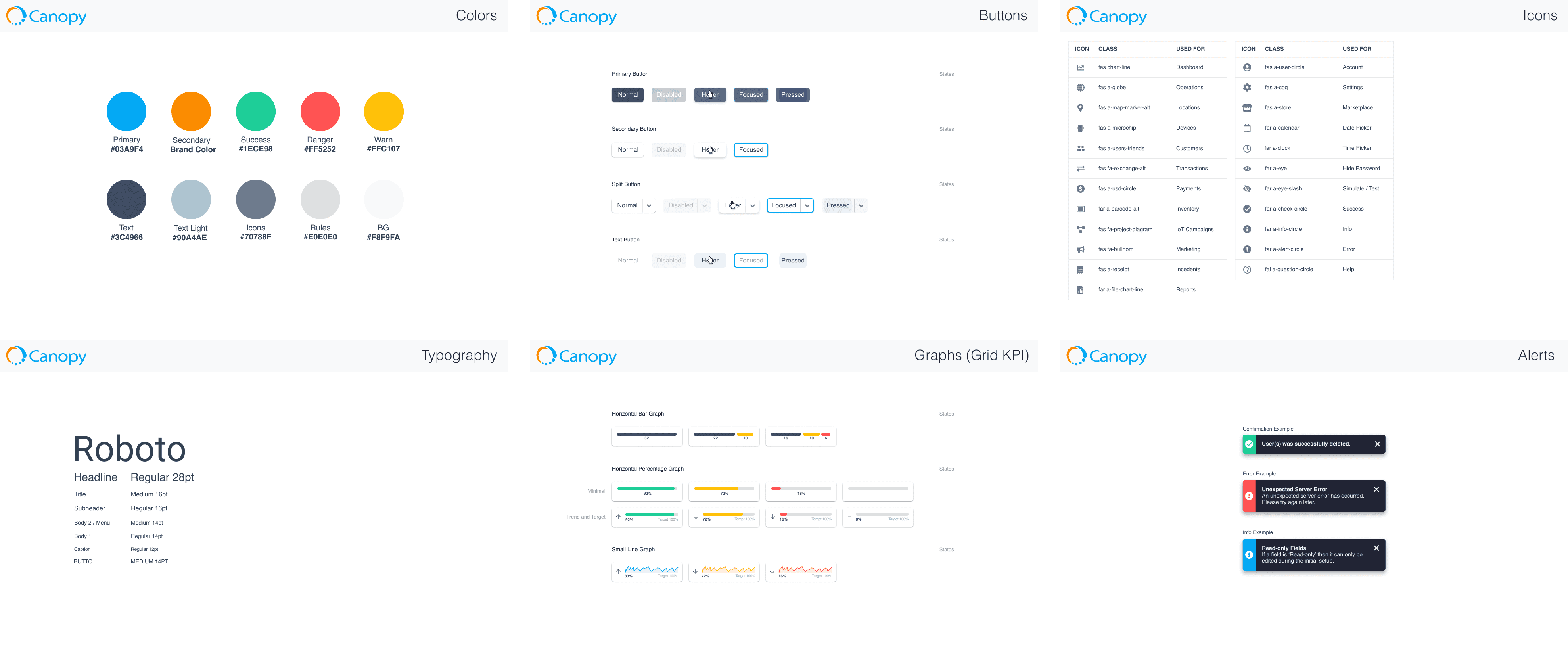
#3- Robust Design System
Design Impact
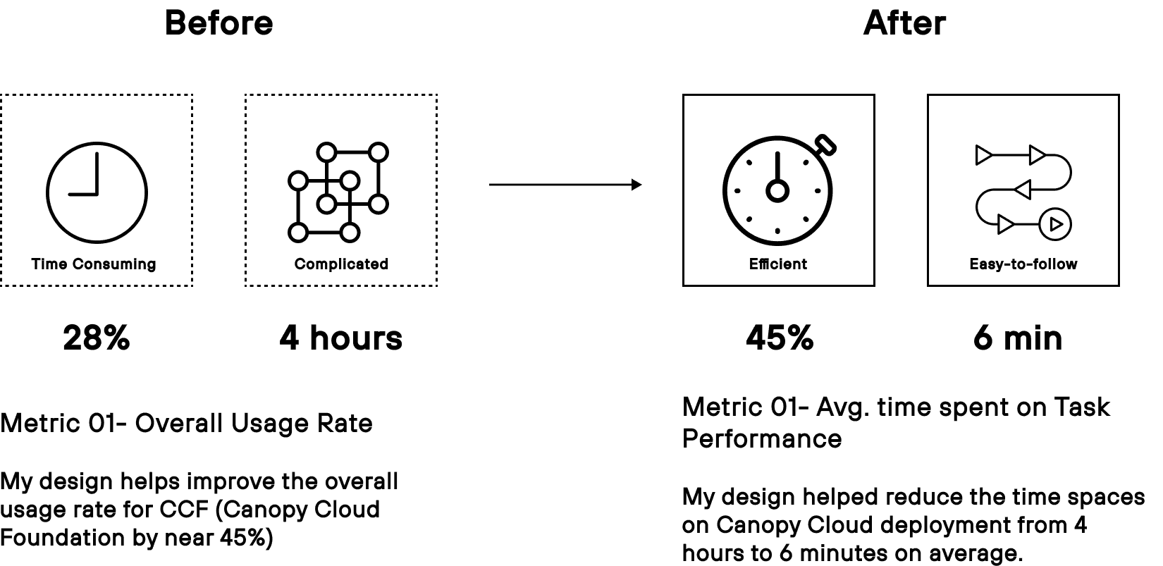
The new design significantly improved the efficiency of Canopy Cloud Foundation platform
Research
How I Analyzed the Human Problems in Canopy Cloud Foundation platform?
In this phase, I conducted in-depth research by creating detailed user personas and mapping out user journeys to gain a comprehensive understanding of my target audience's needs. Leveraging key insights from this research, I developed a data-driven design strategy that aligned with user pain points and behaviors, ensuring a user-centered approach throughout the design process.
Persona
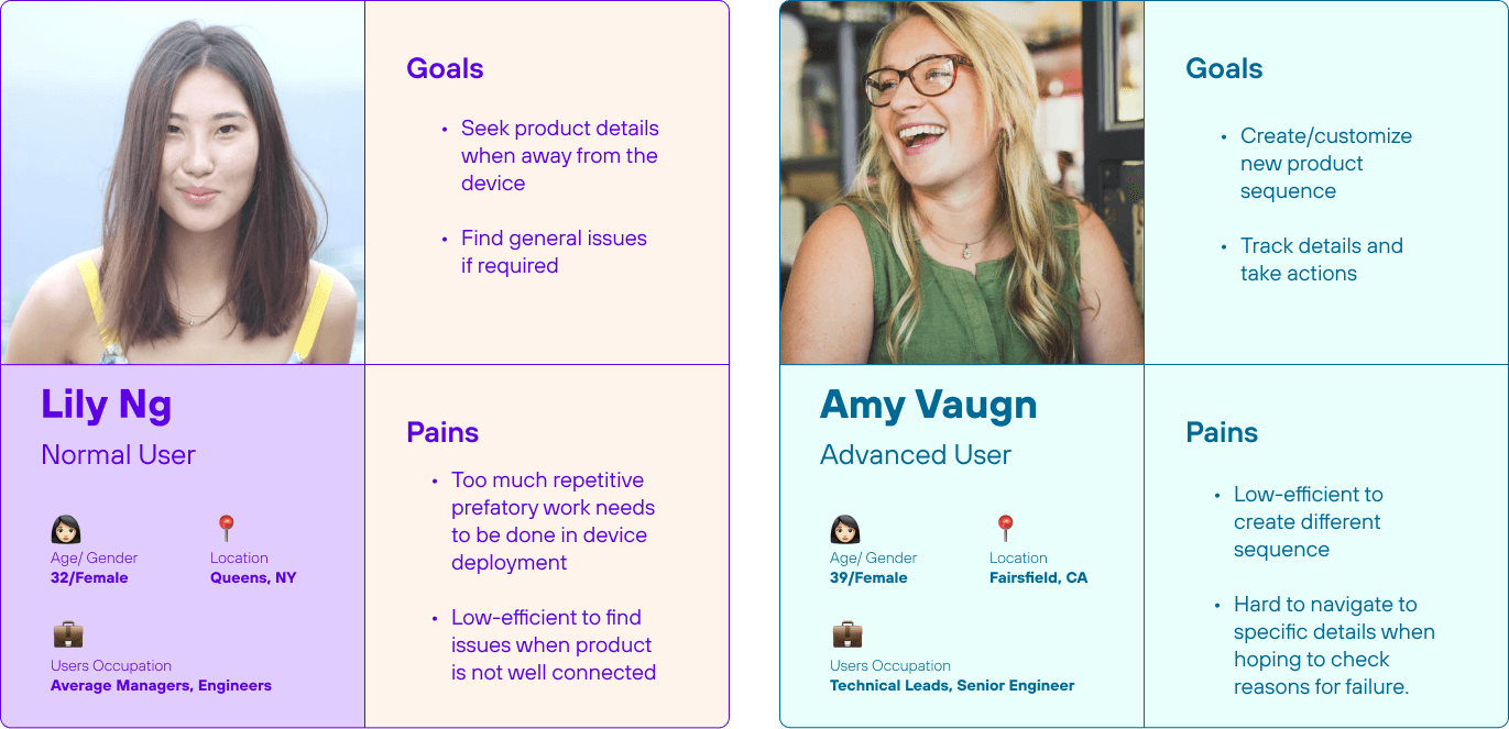
Our normal and advance users
We were able to distinguish our users through normal and advance, which gave the clarity on how features are explored throughout the Canopy Cloud.
User Journey
2 key tasks
Create New Testing Environments vs. Check Testing Results
Research Insights
Normal users want one-click operation & quick overview. Advanced users need customization & detailed records of product
Design Strategy Splitting the application
Regarding that there exist two major tasks in Canopy product testing, after careful consideration, my coworkers and I made the first key decision: to split the entire GUI project into two applications. They are Operations, which aims to help users seek product information after the connection, and Summary of KPI, which helps users to check functionalities of the product. These two applications can navigate within each other.
Design for Application A
(Canopy Cloud Foundation platform) Helping Banyan employees and stakeholders efficiently seek product details through location?
Key Decision #1
How to Help Normal Users Create New Testing Environments with One-click Operation?
Problem
Have to deal with numerous repetitive, confusing parameters?
Outcome
One pop-up box that only shows details that users can check most essential parameters.
Final Feature
In the final design, I created the feature which provides one pop-up page for normal users to quickly view the product details environment with a one-click operation. This feature allows a large number of non-technical employees in Canopy Cloud platform teams to efficiently monitor the product by themselves.
Key Decision #2
To Display Multiple indicators Homepage?
Let Users Make the Choice!
Problem
Once a user has set up his/her account, how to display those product functionalities on screen in a more manageable way?
Outcome
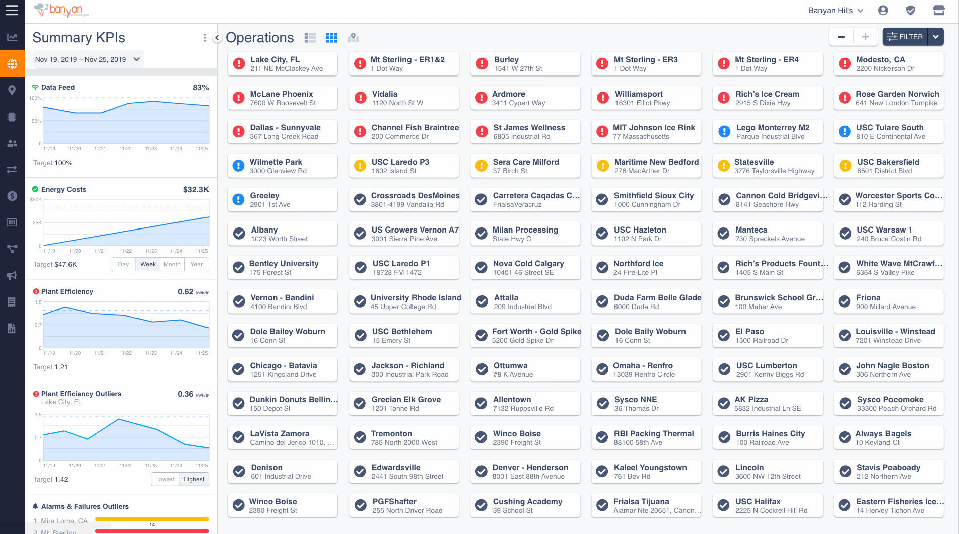
In this case, I designed two kinds of views for it. They are grid view and list view.
Grid View
For normal users, usually, only keep 20 new devices in operations before they expire. As a result, a grid view is a good option for them since it helps review all detailed information of each device at one time easily.
List View
Design for Application B
Helping Banyan Employees Efficiently Check Product Analytics After Connection
Key Decision #1
How to Provide Normal Users with a Quick Overview of Product Analytics?
Problem
Different stakeholders care about different levels of overview.
Outcome
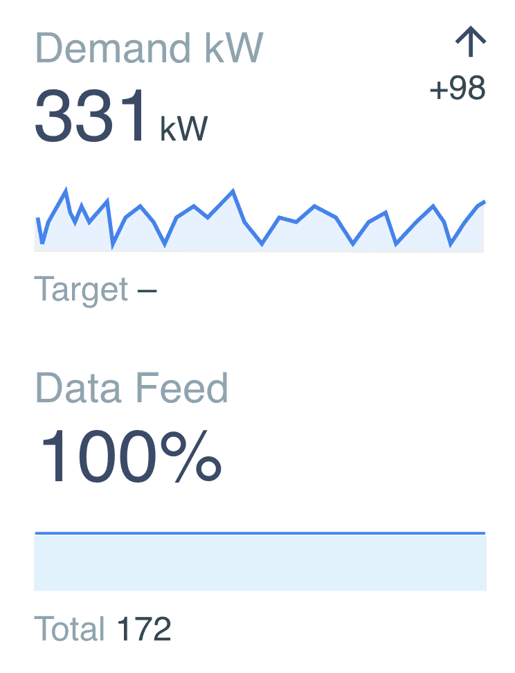
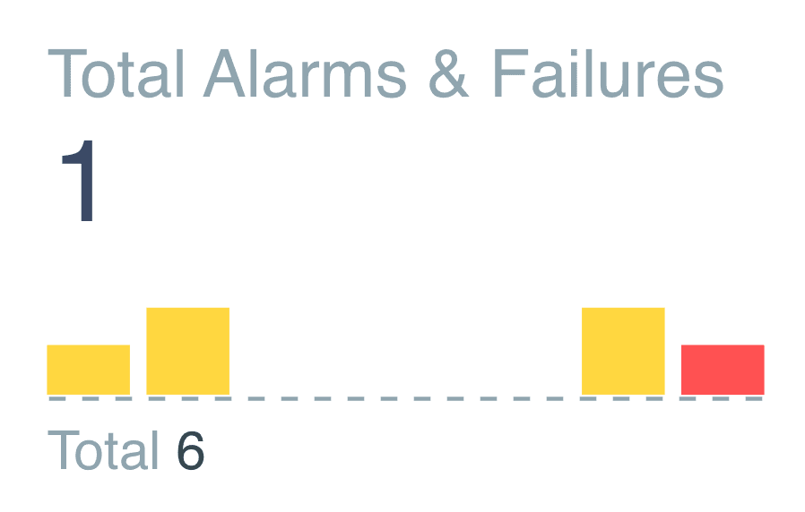
A dashboard of high-level visualized charts catering to different needs among normal users.
Side Project - Illustration Challenge
My manager gave an IoT Illustrative Challenge to demonstrate how customer will user IoT mobile application where the data is connected to the Canopy platform. Following is my imagination, I presented my solution using Illustrator software.
How did it go?
My Learning experience
Be a self-starter and ready to learn new things by yourself
I conducted thorough requirements gathering and problem understanding, followed by a competitive analysis to benchmark existing solutions. I then defined the problem through a customer journey map, which informed my design ideation process. Finally, I validated the initial design concepts with stakeholders to ensure alignment with user needs and business goals.
Prioritize your task checklist since speed matters at work
To meet user needs with great design solutions is a designer’s duty. But it never means you can, or you should take everyone’s needs into account at work. Always learn to prioritize your user need checklist and always start with the most fundamental one from all the others is a vital qualification for a good designer.
A good designer achieves a balance between design values and implementation cost
To fully achieve the greatest design values is all designers’ dreams. But when working in a real teamwork context, we usually have to face many constraints in implementations like limited time and development costs. Consequently, a good designer should learn to make the most of existing resources and simplify their solutions as much as possible in order to achieve a balance between design values and implementation costs.
Takeaways
How did it go?
Shout out to my manager, mentor, and team. I had the opportunity to learn from and collaborate with brilliant minds. Under the guidance of my manager and mentor, I ramped up on a completely new set of design guidelines and processes for the KPI and inclusive design, and also learned how to scope a project and conduct user studies.
Designing KPI applications for IoT products pushed me to think about many different facets of user experience such as product delivery, user expectations and requirement, environment design, and hardware design. Due to COVID-19, my internship was remote, but still, I got to learn how to design with a broader and more deliberate sense of empathy.


