Design for inclusivity
Using Participatory Design to Help People with Color Vision Deficiency
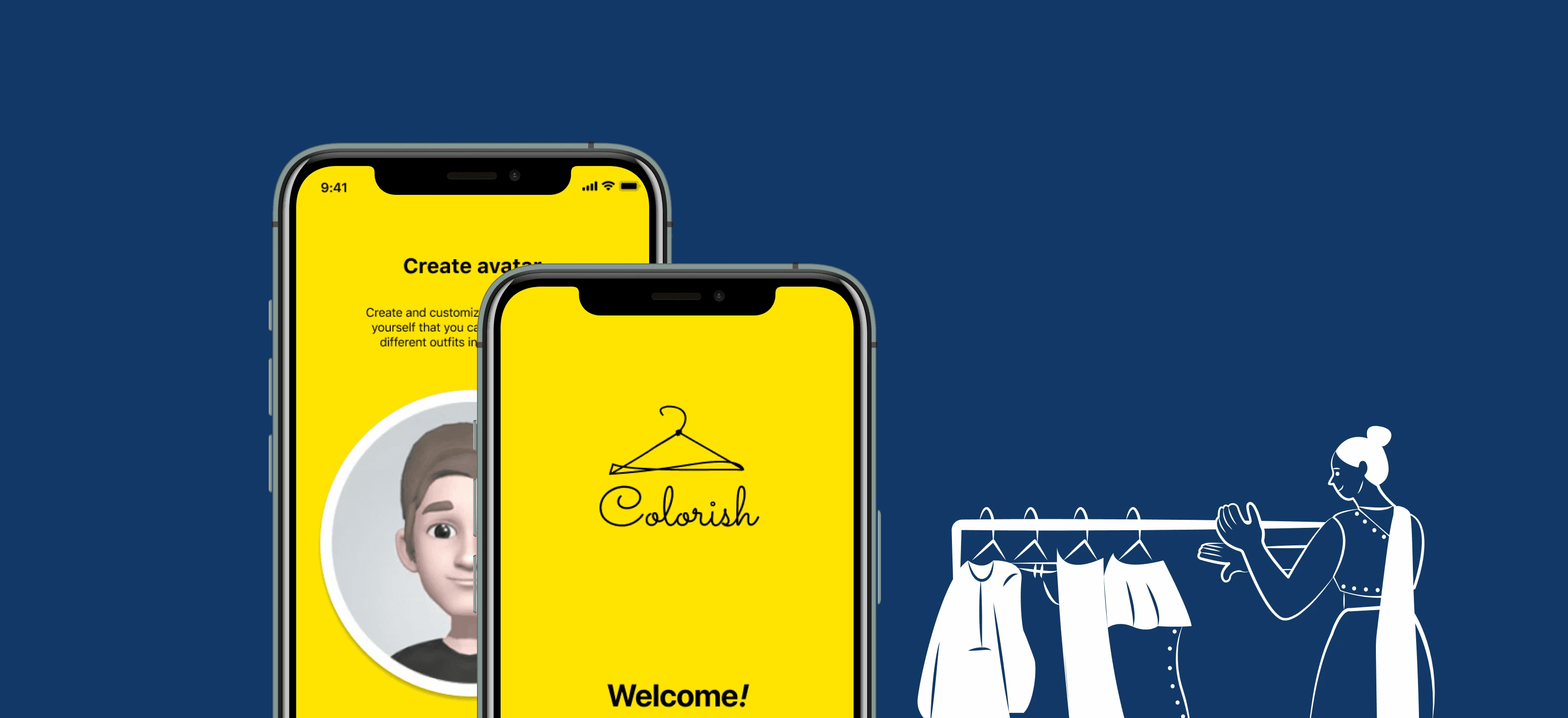
I designed a mobile app that helps color-blind people to pick out outfits. There are lots of color-identifying apps out there in the market. The main purpose of the app is to suggest outfits based on their personal taste. By uploading the photo of their everyday wear, the app, Colorish uses machine learning algorithms to learn users’ personal styles, preferred color combinations, and recommend outfits and accessories that go well together. Users can save their favorite combinations in the app to reduce the burden of choosing outfits in hectic moments.
Problem Space
How might we help people with color blindness pick out clothes and accessories from their wardrobe that match based on their personal style and color preferences?
Outcome
75% of users found the chart showing the wardrobe color palette interesting and insightful. 89% were excited to try all the new combinations from all the clothes in their existing wardrobe that they hadn’t tried before.
Role
UX Designer and Product Designer responsible for ideation, user research, brainstorming, prototyping
Methods
User research, problem identification, storyboarding, design iteration, journey mapping, prototyping, and testing
Duration
Sep 2020- Dec 2020
Team
2 UX Designers/ Product Designers, 2 participants
Final Design and Solution
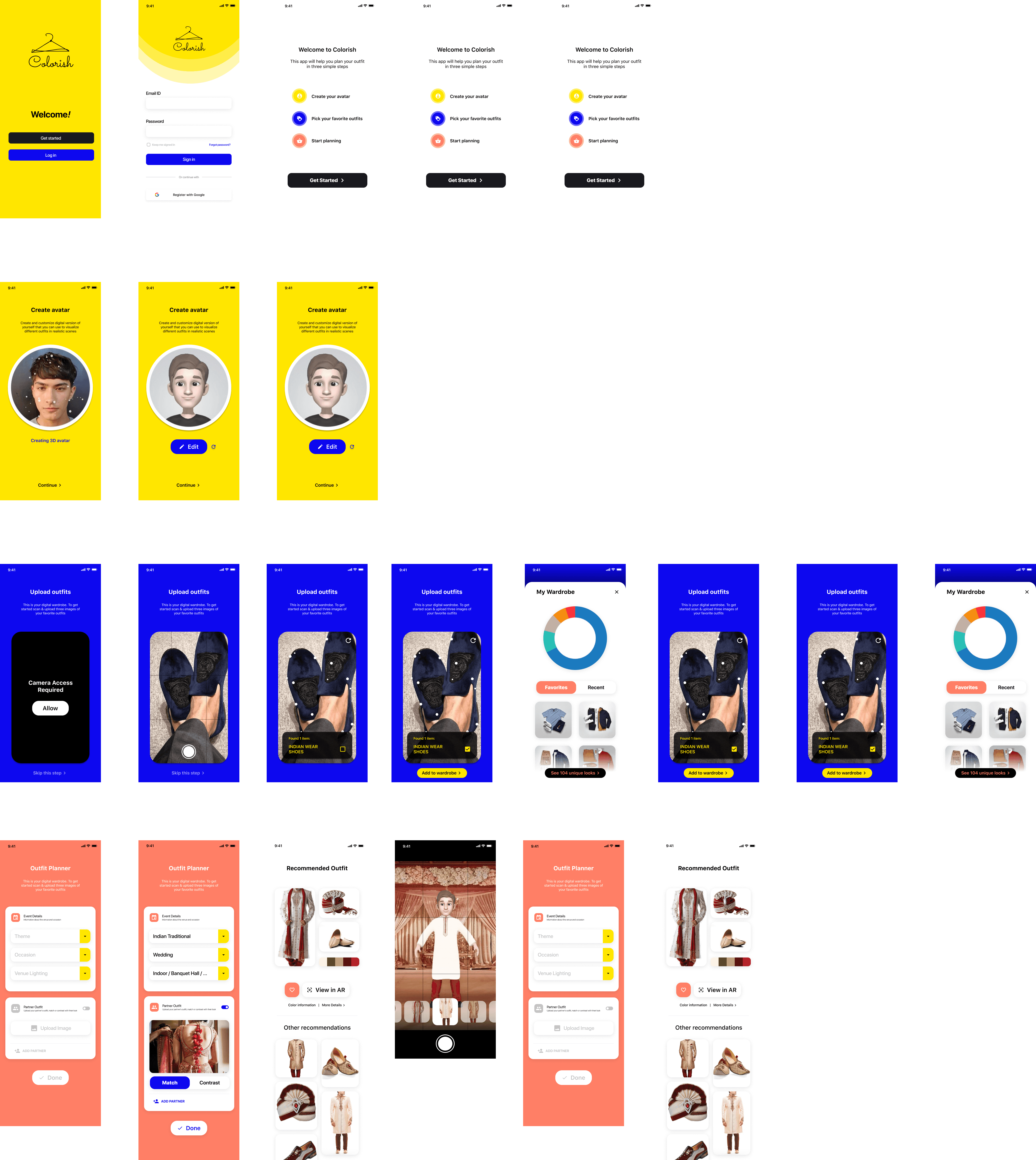
Over 4 months, I developed a multimodal experience for Colorish app, along with a supporting design system. This project aims to help color-blind people outfits based on their personal taste.
Onboarding
Visitors have the option to register and establish a profile, enabling the app to gather insights about them and record their preferences.
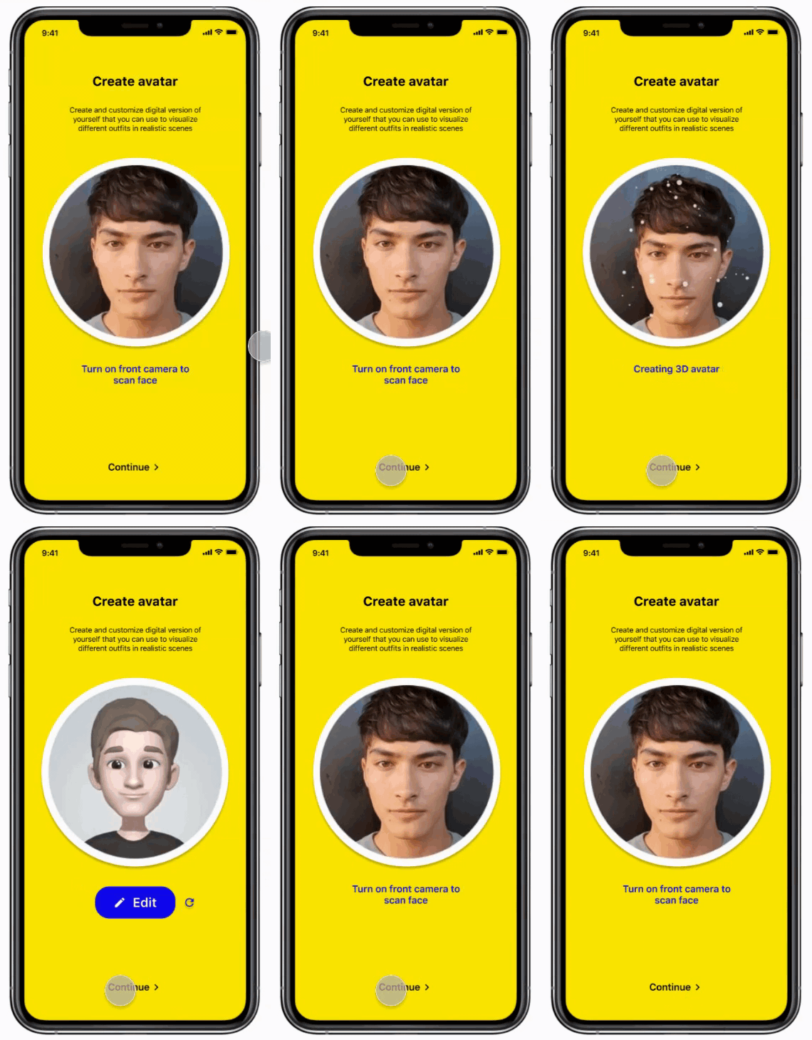
Digital Avatar
The application has the ability to recognize a user's facial features to create a fully personalized avatar. This virtual self can be utilized to experiment with various clothing styles in a range of scenarios with the help of augmented reality.
Scan Outfits
Snapshot your everyday attire and send it to the collection. Automatically identify the hues, fashion, and season of the ensemble. Users have the prerogative to modify the specifics if they desire.
Design Rationale: Rather than requesting users to select a color to understand their preference, users are enabled to digitize their wardrobe by uploading their daily attire. Over time, the system will familiarize itself with the user's favourite color scheme (for instance, monochromatic or complementary) and style preference (like, pants or skirts)
Outfit Planner
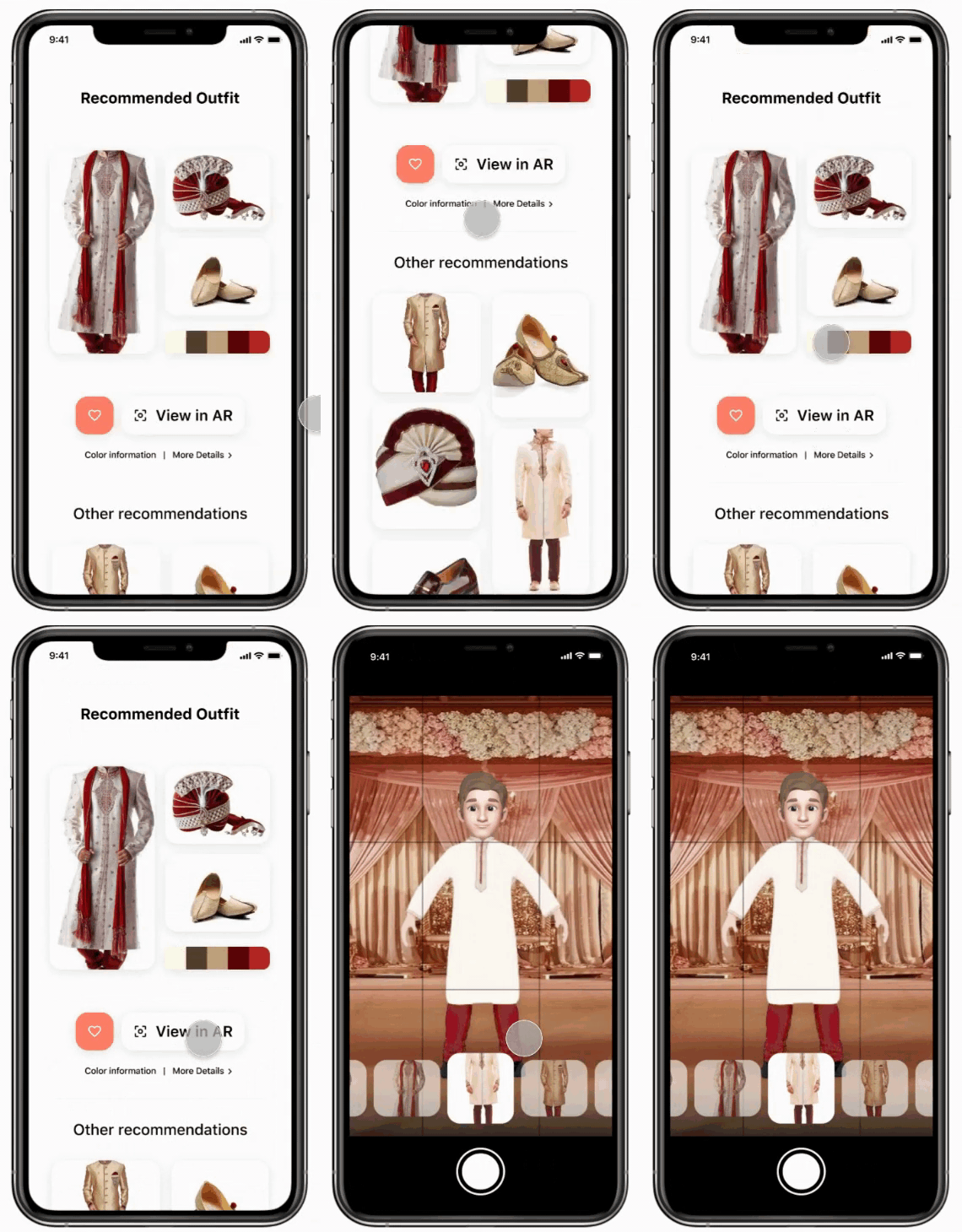
Based on the form inputs and the users’ preferences, our system will recommend the best-looking outfit and a list of other recommendations to pick and choose from.
Design Rationale: Typically, our users choose their preferred top and pair it with a suitable bottom. This process aligns with the app's clothing selection flow. The app eases the task of selecting tops and bottoms by first presenting the least worn top, and then suggesting matching bottoms, addressing the user's preference to avoid wearing the same top repeatedly.
Recommend Outfit
After selecting your attire, peruse our suggested extras (like necklaces, handbags, earrings, and shoes) at your discretion. Feel free to either explore every accessory category or bypass some.
Design Rationale: Emerging from the dialogue, the participant expressed finding the process of pairing accessories somewhat troublesome due to their peculiar liking for certain combinations. Following the virtualisation of all accessories, the application could recommend well-suited options, akin to suggesting tops and bottoms based on their liking.
I have crafted an electronic tool named Colorish. Colorish functions as a mobile application that assists individuals suffering from color blindness in picking and coordinating attire and trimmings and in visualizing themselves within their surroundings using augmented reality. The core concept behind this application is to offer outfit suggestions based on personal preference, enabling users to be self-sufficient in their color combination decisions. Once users upload photos reflecting their preferences, they get to utilize the Augmented Reality feature which serves up a swift preview of the ensemble, suitable color pairings, and matching accessories for a complete look.
User Research
Conduct user interactions to understand their challenges
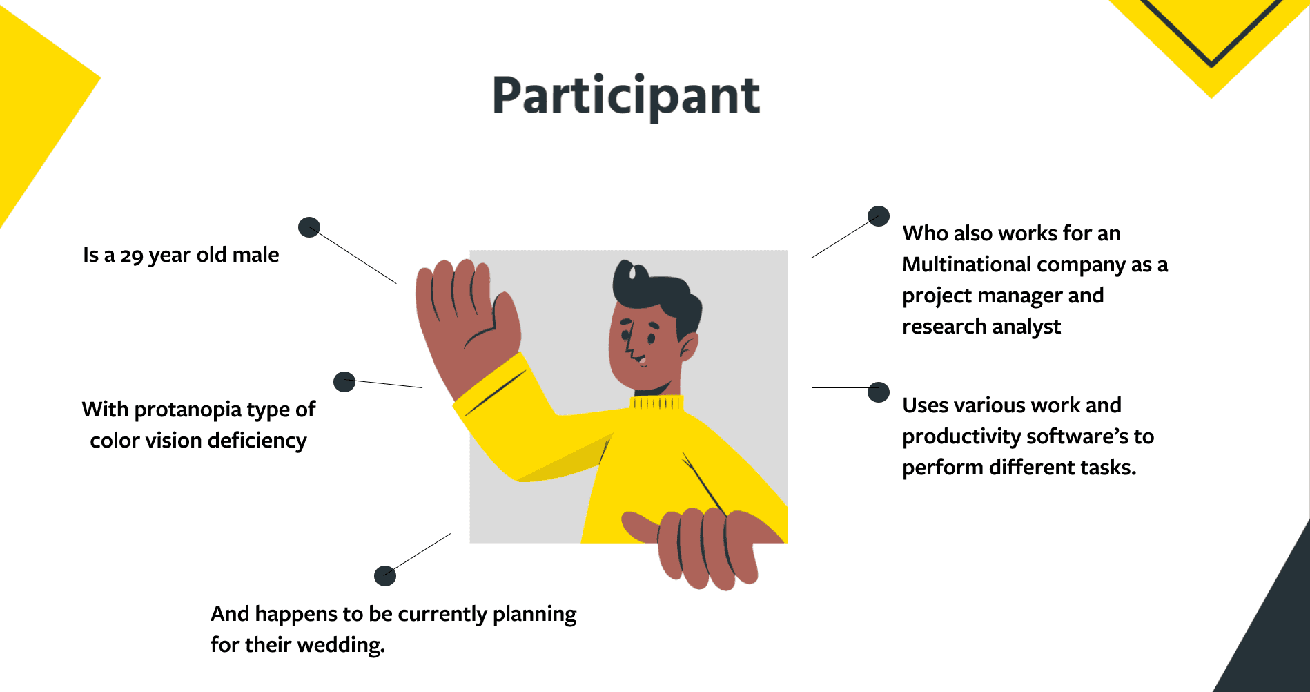
I conducted preliminary studies to initially grasp the concept of color blindness and to gain a comprehensive understanding of potential issues they might encounter in daily living. Subsequently, we enlisted a color-blind individual as our subject, to delve further into the obstacles he confronts in his profession and personal life, his perspective on color blindness, and to uncover his desires and necessities associated with being color-blind.
Storytelling
Challenges came from the personal life instead of work
During the conversation, he elaborated on his trials and tribulations and the usual ways he navigated them. Intriguingly, his primary difficulties stemmed more from personal predicaments associated with color rather than professional aspects, contrary to our assumptions. He mentioned that he had the ability to prepare in advance for his job, such as validating the color prior to client engagements, but the predicaments he faced in his personal life were more unpredictable. As a result, we opted to center our attention on the personal issues he faced. Subsequently, we derived key insights and identified problem areas to structure our design solution around.
Empathy Map
The empathy map helped us create a shared understanding of the participant's needs and populate design ideas.
Analysis of Interview
Incorporates particular examples from the dialogues
Insights
We debriefed the interview and brainstormed, we came up with the following findings that encouraged us to inform design direction.
Problem Identification
Upon the user interview, we identified one problem as above to help us focus on the project goal and converge our brainstorming ideas. The problem statement was constructed due to the fact that the participant had a hard time matching tops, bottoms, and accessories in her daily life. Being a mom and working full-time, she didn't have time to play with different combinations every morning even though she wanted to, especially when it comes to the color-matching with accessories.
Codesign Innovative
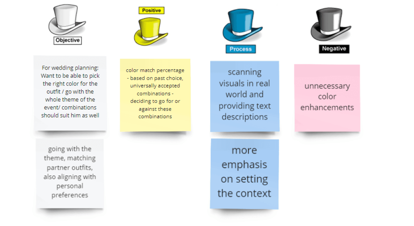
Bono Hats
During the co-design meeting, I proposed the idea of an intelligent wardrobe to the participant. The intelligent wardrobe was a program that would primarily comprehend the color pairing choices of the users. Once users digitized their wardrobes, the application would offer recommendations based on their individual tastes, shades, and fashions. Through the co-design discussion, we managed to confirm a few of our conjectures with the user.
Design Idea Iteration
Post the collaborative design meeting, I incorporated her input to build the mockups. For instance, I included an option for selecting accessories. This is where we introduced the concept of machine learning. The machine, based on user-uploaded data (such as photos), will identify and learn their tastes. This allows users to snap a picture of their daily outfit instead of having to digitize their entire wardrobe in one go. However, the caveat is that the learning curve for the machine requires time, meaning that the first month of usage will be purely for amassing a dataset for the app's training.
Visual Design
After studying user needs and comprehensive research, our team selected three suitable colors for the mobile application along with their specific shades. We chose to maintain color continuity, while enhancing the vibrance and dynamism of the blue, red, and yellow by tweaking their tones and saturation levels.
High Fidelity Wireframes
Utilizing the graphic design framework, a detailed model, as depicted on the right, was crafted by me. I conducted several impromptu assessments while developing the model to confirm that I was addressing the problems identified in earlier usability examinations. Subsequently, the model was examined using Maze by a group of 12 testers.
Solution
Create a design solution that helps color-blind people solve their challenges in their life and work
Inclusive Design
We were able to distinguish our users through normal and advance, which gave the clarity on how features are explored throughout the Canopy Cloud.
Excited to try all the new combinations from all the clothes in their existing wardrobe that they hadn't tried before
Augmented Reality might be worth a shot if it works
The “add partner” feature led them to think that this application will later evolve into another social media app and will eventually lose its meaning when shopping becomes the main objective afterward
They found the chart showing the wardrobe color palette as interesting and insightful
Project Learnings
Seek out feedback early and work continuously
The trouble with most of us is that we would rather be ruined by praise than saved by criticism. Keeping the users in the loop and testing solutions in whatever form (paper, low-fi, or hi-fi) as early as possible saves an ample amount of time and re-work.
Map out
Create a strategic plan to launch an app. It helps deal with requests that could potentially detail the project and help deliver a quality product in time.
